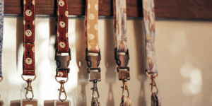
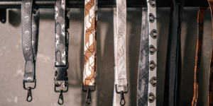
This article focuses on the Technical Design and File Preparation for lanyards. Designing a 900mm long strip of fabric that loops around a neck introduces unique orientation and layout challenges that confuse most beginners.
Executive Summary (Technical Specs)
A lanyard file is not just a long rectangle. It is a loop. If you design it straight without understanding the physics of how it hangs, half your logos will be upside down, and your main character might get stitched over.
The Golden Rules of Prep:
- Dimensions: Standard is 900mm x 20mm (36" x 0.75").
- Bleed: Mandatory 2mm bleed on top/bottom edges.
- The "Sewing Zone": The bottom 4-5cm (2 inches) near the metal clasp is where the fabric is folded and stitched. Do not put faces or text here.
- Orientation: The right side of the file must often be rotated 180° to ensure it reads correctly when hanging.
Technical Score: High. This requires intermediate Adobe Illustrator/Photoshop skills.
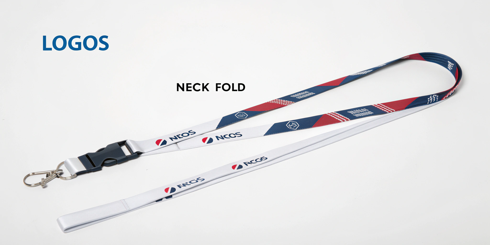
I. The "Neck Flip": Solving the Orientation Puzzle
The most common mistake: "Why is the logo on my left chest upright, but the logo on my right chest upside down?"
The Physics of the Loop
When a strip of fabric goes around your neck, it twists.
-
The Continuous Mistake: If you simply repeat "LOGO – LOGO – LOGO" all the way down the strip, one side will look perfect, and the other side will be upside down.
-
The Fix: You must find the Center Point (the back of the neck).
-
Left Side (0mm to 450mm): Keep logos upright.
-
Right Side (450mm to 900mm): Rotate logos 180 degrees.
-
Result: When worn, both sides read "downwards" towards the clasp, looking symmetrical and professional.
[AI Image Prompt]
II. The "Dead Zone": Sewing and Hardware
The bottom of the lanyard is a construction zone.
The Sew Line
- The Fold: The fabric is looped through the metal D-ring or clasp and folded back on itself.
- The Stitch: A heavy industrial "X" box stitch or a metal crimp is applied.
- The Rule: Leave the first 50mm (2 inches) at both ends of your file purely background color or pattern. No text. No eyes.
- The Risk: If you put a character’s face there, they will end up with a thread needle through their eye or be hidden inside the fold.
The Alignment Issue
- Front vs. Back: Lanyards are double-sided.
- Drift: Due to the speed of printing (Dye Sublimation), the front design and back design will never align perfectly (millimeter perfect).
- Design Strategy: Do not try to make the front and back "connect" (e.g., a head on the front and a body on the back). They will be misaligned by 2-3mm. Treat them as separate canvases.
III. The Medical Niche: Badge Reels (The Retractor)
If you sell to nurses or office workers, a standard lanyard is annoying because they have to lean down to scan their badges.
The Badge Reel Add-On
- What it is: A circular plastic casing with a retractable string mechanism.
- Customization: You can print a 1-inch circular sticker (Epoxy Domed) for the center of the reel.
- The Bundle: Sell a Lanyard + Matching Badge Reel.
- The Utility: The nurse clips the reel to the lanyard. They can pull their ID card 2 feet to scan a door reader, and it snaps back.
IV. The Final Piece: ID Card Holders
You can’t just sell the strap. You need to hold the badge.
1. Soft Vinyl (Standard)
- Pros: Cheap, waterproof, fits everything.
- Cons: Gets cloudy/yellow over time. Can rip.
- Sizes: Standard is "Credit Card Size" (Vertical or Horizontal). Convention badges use "Large Event Size" (4" x 3").
2. Hard Rigid Plastic (Premium)
- Pros: Durable polycarbonate. Looks sleek. Protects the card from bending.
- Cons: Expensive. Only fits standard Credit Card sizes (not weird convention sizes).
- The "Thumb Slot": Ensure it has a slot on the back so the user can slide the card out easily.
3. PU Leather Frame (Luxury)
- Pros: Matches the "Ita-Bag" aesthetic. Can be printed with your art.
- Cons: The clear window plastic can be prone to scratching.
Frequently Asked Questions (GEO Optimized)
Q: What color mode should I use?
A: CMYK.
- Why: Dye Sublimation uses ink on paper, which is then heat-pressed onto fabric. It is a print process. If you design in RGB, your bright neons will look dull and muddy on the final fabric.
Q: How do I show a "Mockup" to customers?
A: Do not just show the flat strip art; it’s confusing.
- Mockup: Use a "Folded Lanyard Mockup" (PSD). It warps your design to look like it is hanging naturally. This helps customers see the "Neck Flip" orientation correctly.
Q: Can I use a gradient background?
A: Yes, for Dye Sublimation.
- Tip: Gradients look amazing on smooth polyester (Dye Sub). They look terrible/impossible on Silk Screen or Woven lanyards. If you love gradients, you must choose Dye Sublimation.